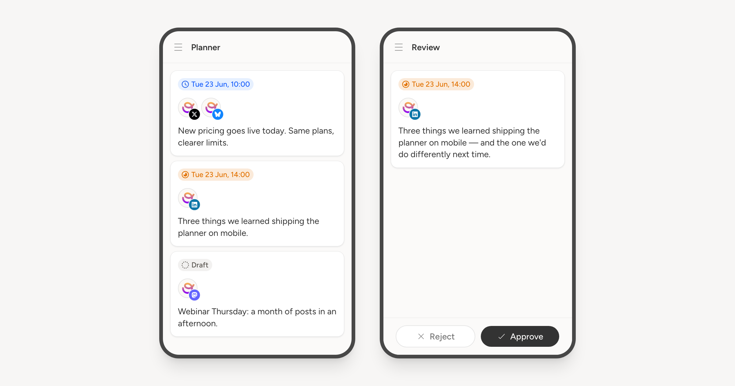
Most of what you do in Orbitwrite now works on a small screen, rather than being a desktop layout you have to pinch at.
Navigation moves into a menu behind the header. Settings becomes a list you tap into, with a back link, instead of a sidebar squeezed against the content it is meant to sit beside.
The calendar shows coloured dots per day. Tap a day and its hours slide up from the bottom, where tapping an hour starts a post there. The planner becomes a list, and you swipe left and right to move between accounts.
In the composer the panels go behind one menu and open as a sheet you can swipe away, which is how the AI assistant, comments, preview and post details all work now. Swiping the editor itself moves between accounts.
Reviewers get approve and reject in a bar pinned to the bottom of the screen, so a review is a couple of taps from a notification.