A calendar is the right shape for a week and the wrong shape for a paragraph. Once posts are long enough to matter, a grid cell shows you the first six words and hides the rest.
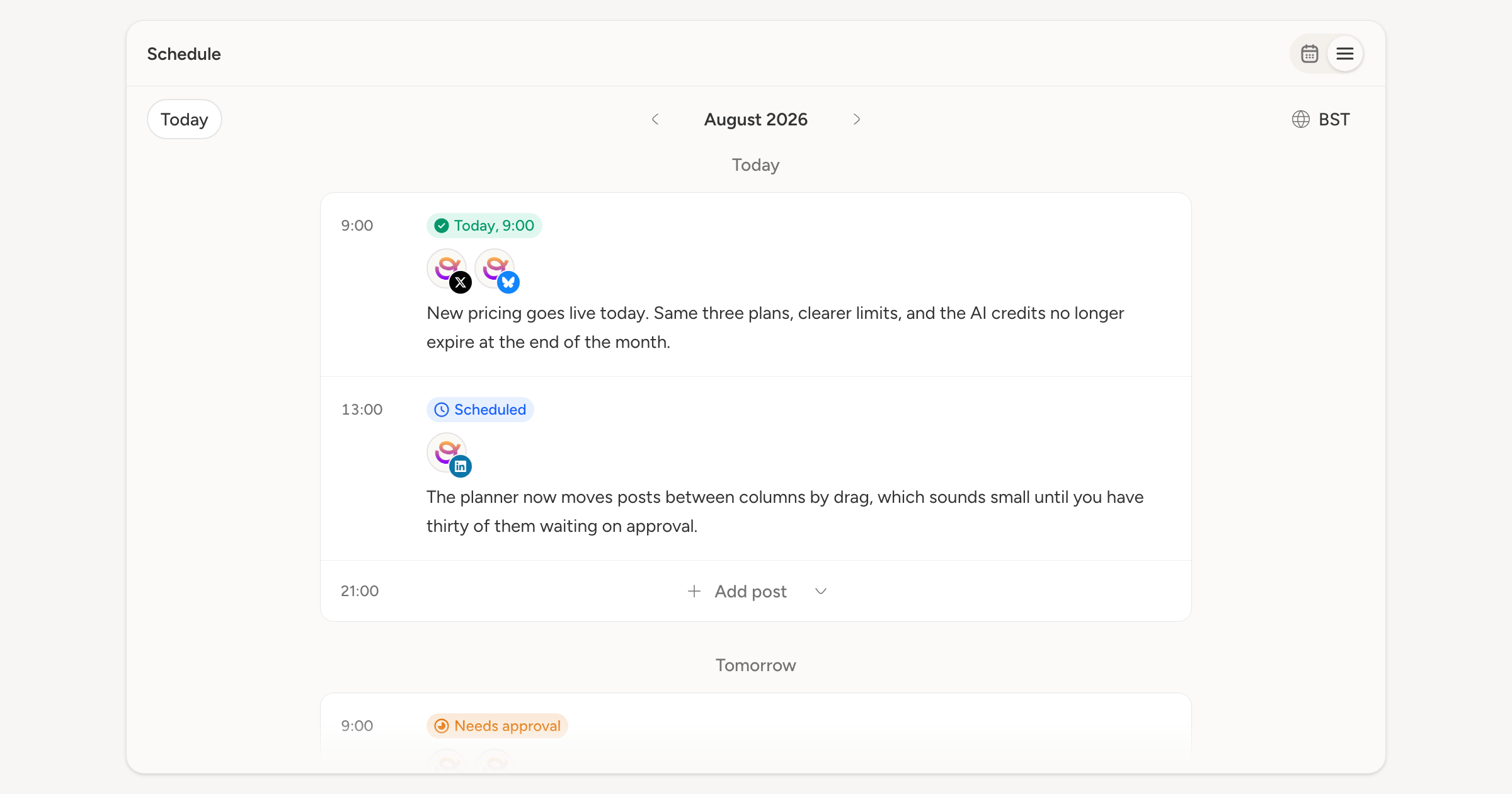
The schedule now has a second layout. The control at the top right switches between Calendar view and List view, and the choice lives in the URL, so a link to the list opens as the list and Back does what you would expect.
What the list gives you
A month, day by day, with each day as a card and each post as a full row: enough of the text to recognise it, the accounts it goes to, its status, and its time down the left.
Empty posting slots stay in the list rather than disappearing. Each one shows its time and an Add post button, so the gaps in your week are still the thing you click. In All accounts the button asks which account to write for; when you have filtered to one, it just opens the composer for it.
Days that have already happened only show what actually happened. No empty slots for times that have gone, because you cannot schedule backwards.
The same schedule
Posts drag between slots here exactly as they do on the calendar, so moving Thursday morning to Friday afternoon is the same gesture in both. Today, the month arrows, the timezone picker, and the account filter all carry over, and opening the list drops you at today rather than at the first of the month.