Six columns is a lot of board. Drafts, Needs approval, Needs revision, Approved, Scheduled and Posted fit comfortably on a wide monitor and less comfortably on a laptop, where the last two are always just off the right edge.
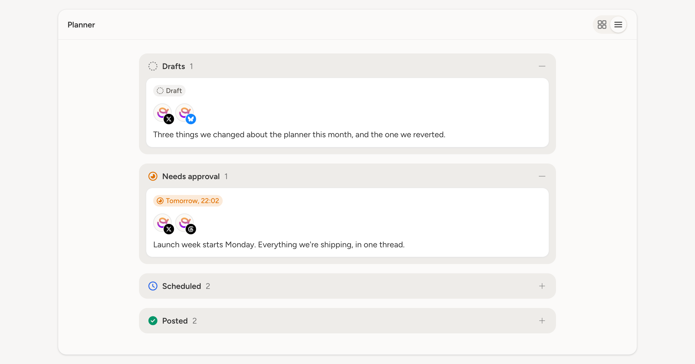
The planner now has the same control the schedule got: Posts view and List view at the top right, remembered in the URL so a link opens the way you left it.
Stacked, not scrolled sideways
List view keeps the stages and drops the columns. Each one becomes a full-width group down the middle of the page, in the same order, and the page scrolls as one thing. A stage with eleven drafts in it is a long group you scroll past, not a column with nine cards hidden below its own fold.
Groups still collapse. Click a stage's heading to fold it away when you are only interested in what is waiting on approval.
Everything else is the same
The cards are the same cards. Drag one from Drafts onto Scheduled, or onto Needs approval, and it moves exactly as it does on the board, with the same rules about who may drop what where. Right-click, the ... menu and the account filter all work unchanged.
It is also the layout a narrow screen gets, because a board that scrolls sideways is no use on one. Choosing it on a wide screen is the same view, deliberately.