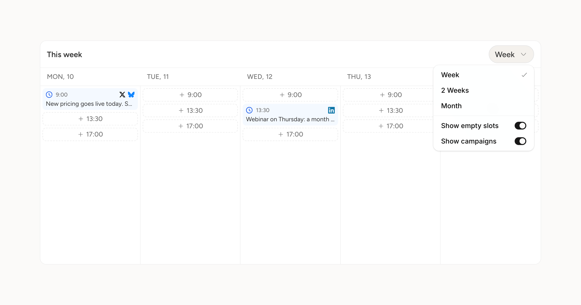
The week and day views on the schedule have been reworked around the thing you actually do there, which is filling gaps.
Your posting slots now appear in the grid as empty chips showing their time. Click one and the composer opens for that slot. No hunting for the right hour and no hover-to-find-the-plus.
A line marks the current time down today's column, so where you are in the week is obvious at a glance.
On a phone, the day drawer gained week navigation, a Today button, and swiping between days.